Client overview
SVS Panel & Paint is an automotive repair business whose reputation is experienced through its workshop, vehicles, customer communication and local visibility.
SVS Panel & Paint · Automotive services
An identity refinement and physical rollout connecting vehicles, premises, signage and day-to-day customer material.
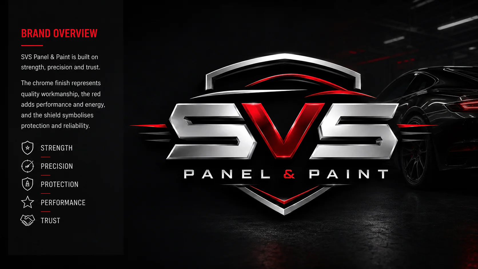
Brand design delivered through Vivid Icon with signage and production capability from the sister-company network.
SVS Panel & Paint is an automotive repair business whose reputation is experienced through its workshop, vehicles, customer communication and local visibility.
Service businesses often accumulate inconsistent applications over time. The task was to create a practical identity that could survive real production constraints and remain recognisable across premises and moving vehicles.
The work considered vehicle shapes, viewing distances, workshop conditions, sign placement and the information customers need when locating or contacting the business.
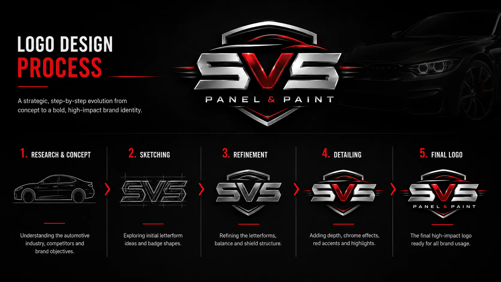
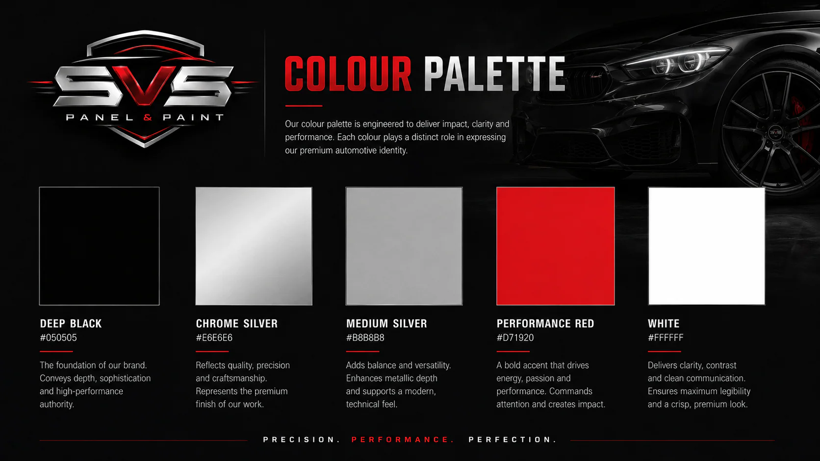
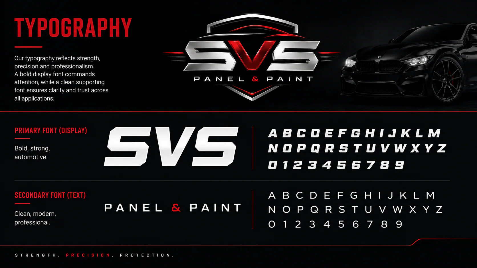
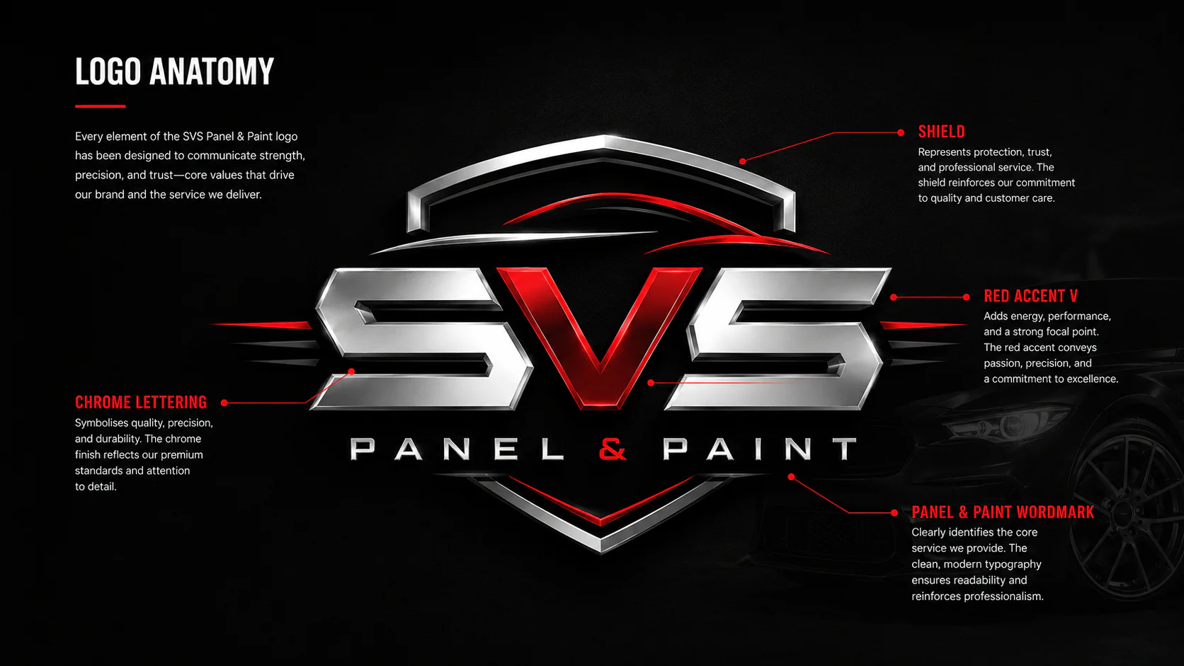
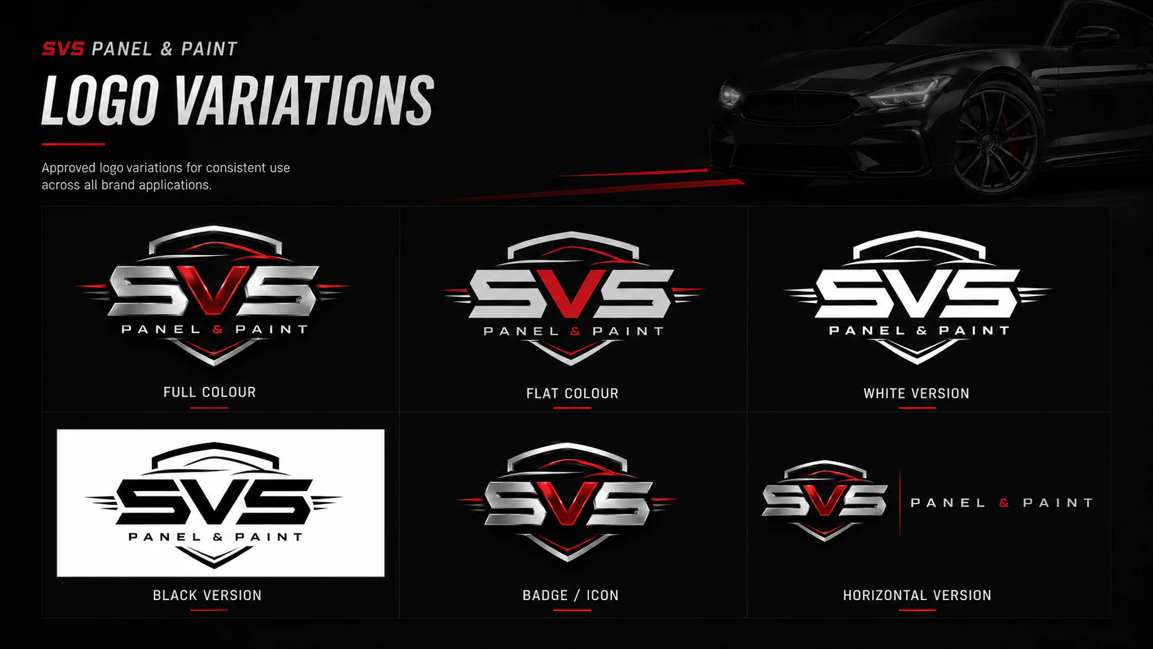
The identity was simplified into a small set of dependable assets with strong contrast and clear hierarchy. Each application prioritises recognition first, followed by the information relevant to its context.
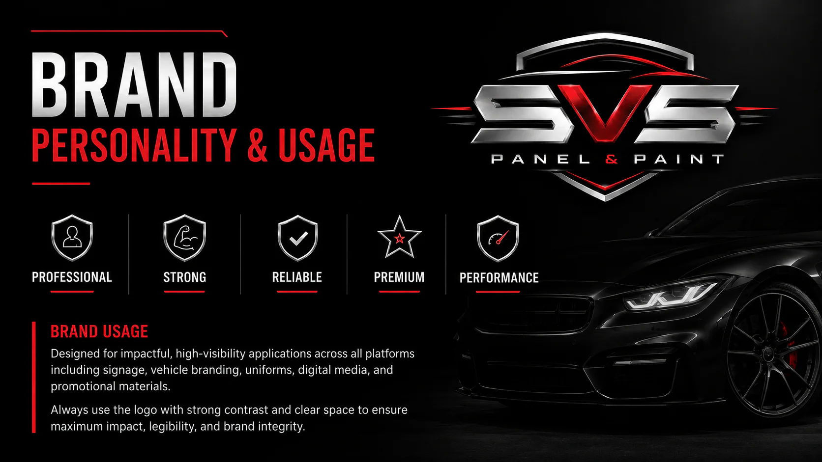
A direct, robust visual language suits the automotive category without relying on generic mechanical imagery. Consistent type, colour and placement create cohesion across different production surfaces.
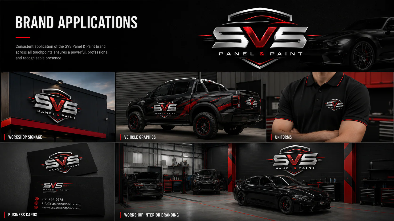
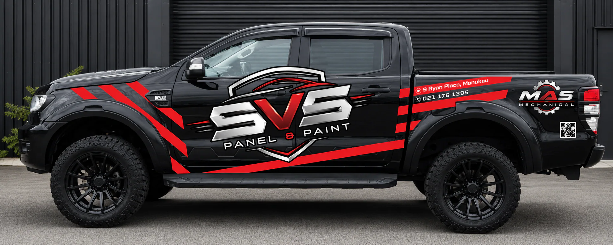
The identity was applied to vehicles, workshop and exterior signage, customer-facing collateral and supporting brand material, with artwork developed for practical fabrication.
Application imagery documents how the system holds together across changing vehicle proportions, architectural contexts and working environments.
Deliverables
Outcomes
Lessons learned
Evidence note
The case study documents the delivered identity and physical applications without claiming unverified commercial performance.
Choose a useful next step