Client overview
Uppers is a consumer food brand whose identity needs to work at product scale, in fast-moving social environments and across highly visible campaign placements.
Uppers · Food and consumer products
A bold identity carried through product, packaging, social communication and large-format campaign applications.

Delivered by the team behind IMPRNT through Vivid Icon.
Uppers is a consumer food brand whose identity needs to work at product scale, in fast-moving social environments and across highly visible campaign placements.
The system needed immediate recognition without becoming visually repetitive. Product information, appetite appeal and campaign headlines all had to remain clear across formats with very different viewing distances.
The work considered the short attention available in retail and campaign settings, the relationship between masterbrand and individual product, and the practical production demands of small packs and large media.
A small number of distinctive visual assets were given clear jobs. Strong scale, repeatable composition and disciplined contrast allow the brand to remain recognisable while individual communications change.
The visual direction is confident, graphic and product-led. Close product framing and emphatic typography create impact, while the underlying grid protects consistency across channels.
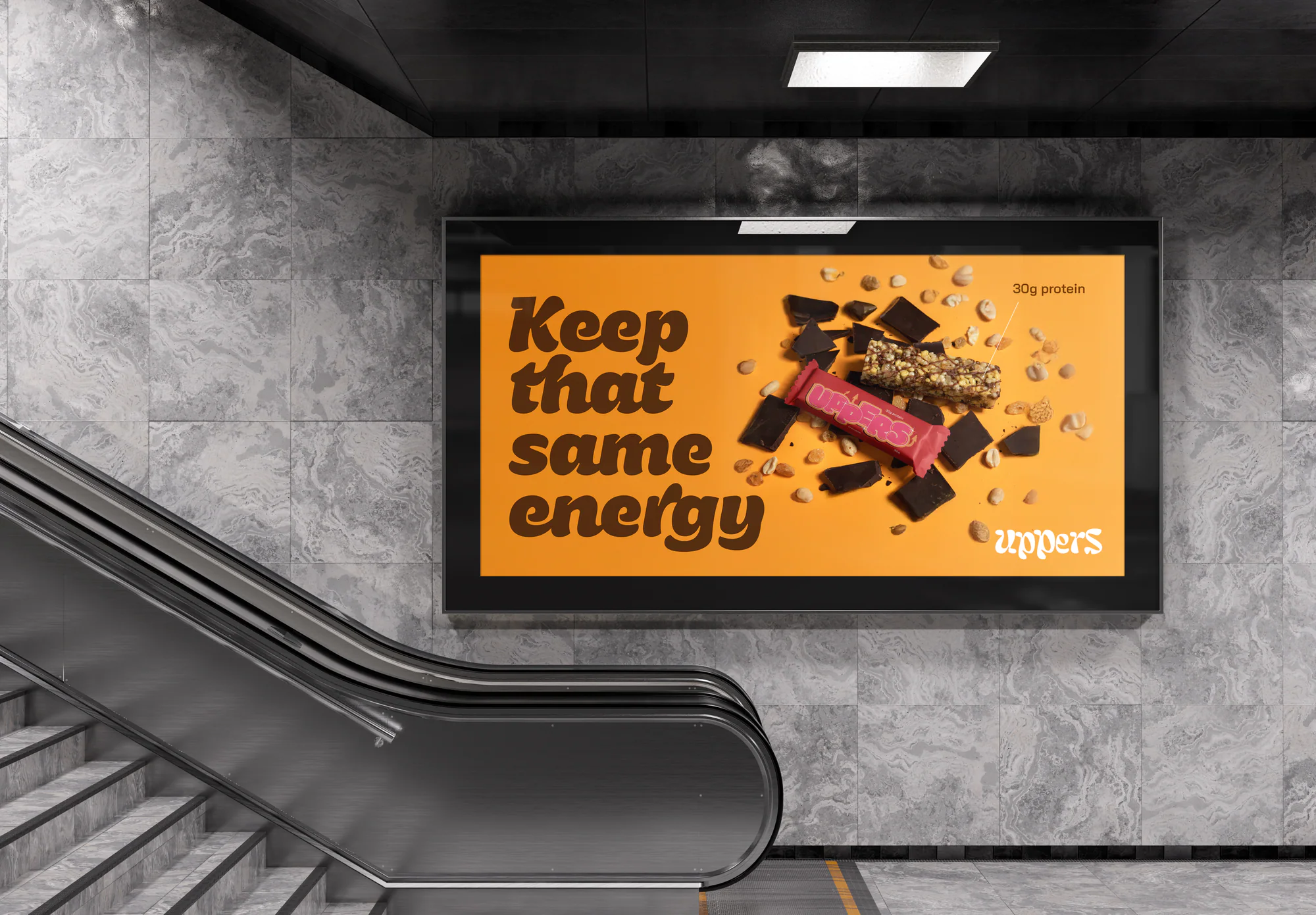
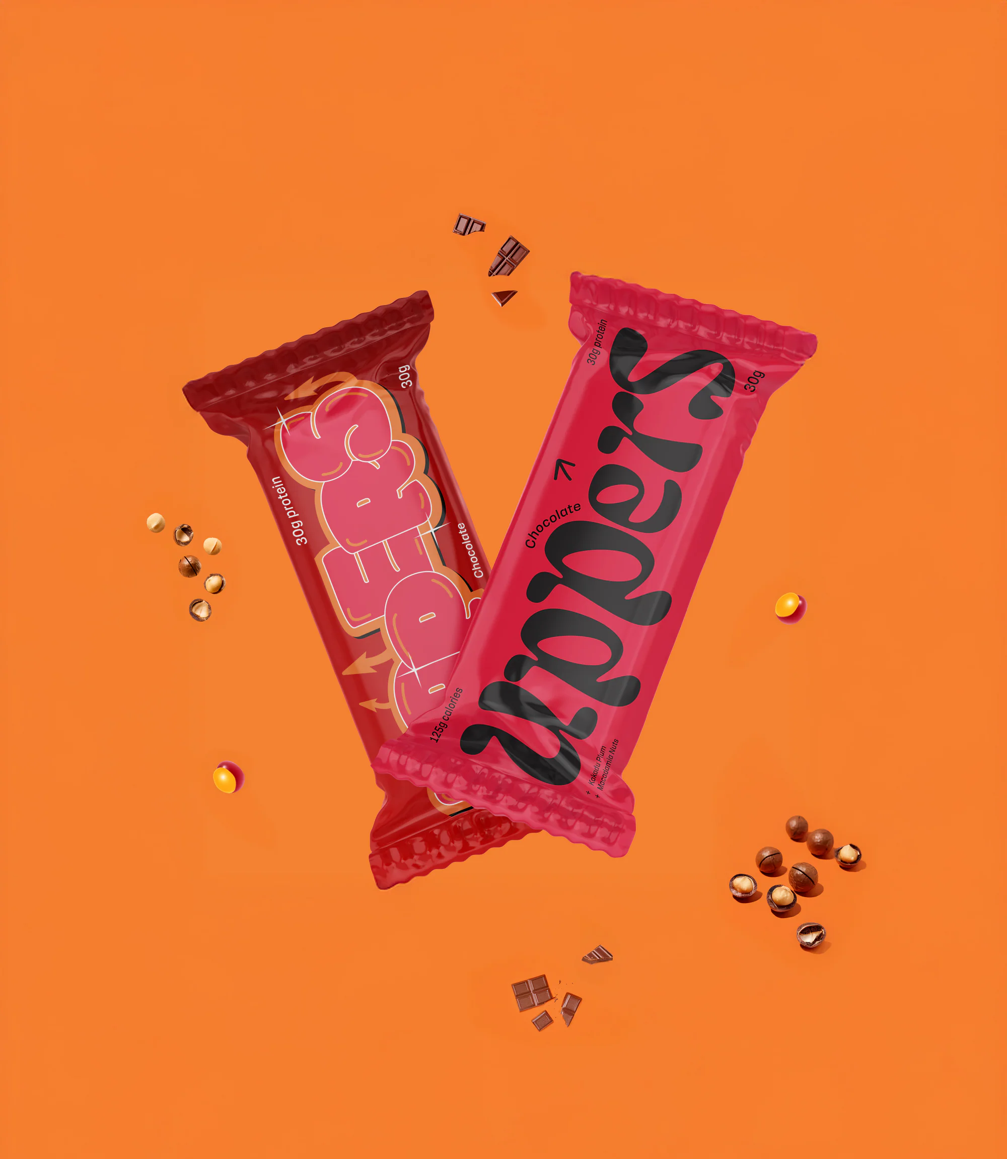
The identity was demonstrated across packaged bars, social creative and large-format placements. The system scales from detailed product communication to fast, high-visibility campaign moments.
Product imagery emphasises texture and appetite while maintaining enough negative space for controlled messaging and campaign adaptation.

Deliverables
Outcomes
Lessons learned
Evidence note
The study presents delivered creative outputs only and does not publish unverified sales or campaign-performance claims.
Choose a useful next step